Kasey Yang
Cloud Workout
Client Project
Role: UX Consultant
I worked with a Y Combinator funded startup, Cloud Workout, on a calendar with improved accessibility and keyboard shortcuts. I provided testing and heuristic evaluation on an existing site, as well as created branding guidelines and mockups for further use by the team.
Software used: Adobe Illustrator, Sketch, InVision
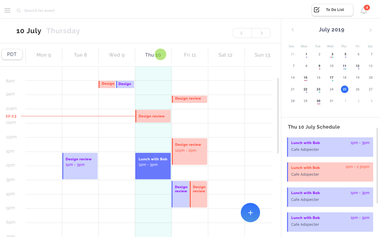
Original Site
There were a few issues that the founders wanted to address with the initial site. First, there was concern over whether or not the side bar was visible enough for creating events. Then there was also general concern about the site not being engaging or modern-looking enough.
First Iteration
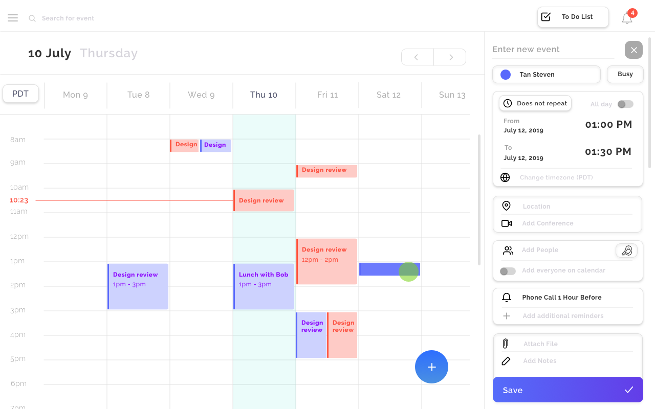
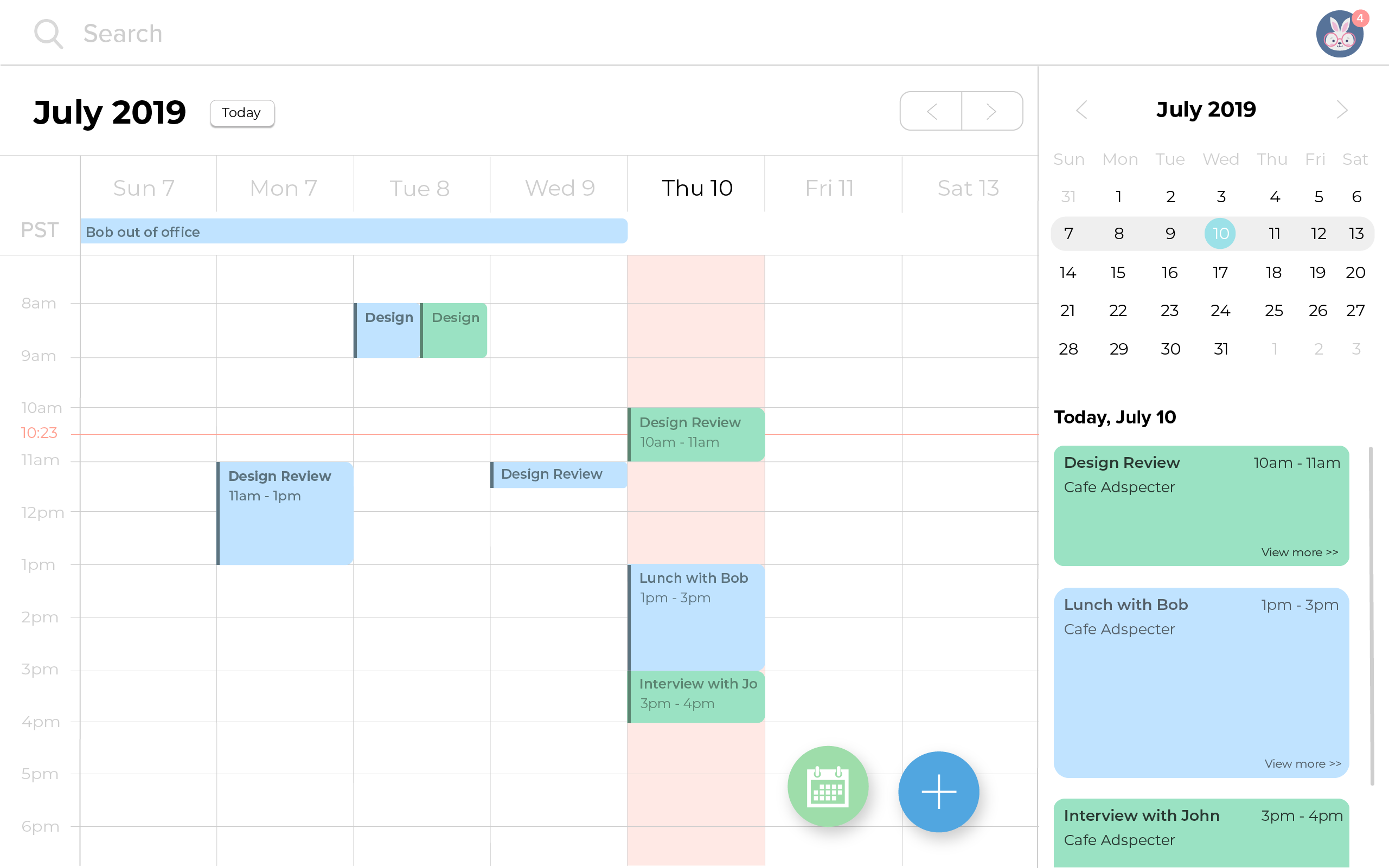
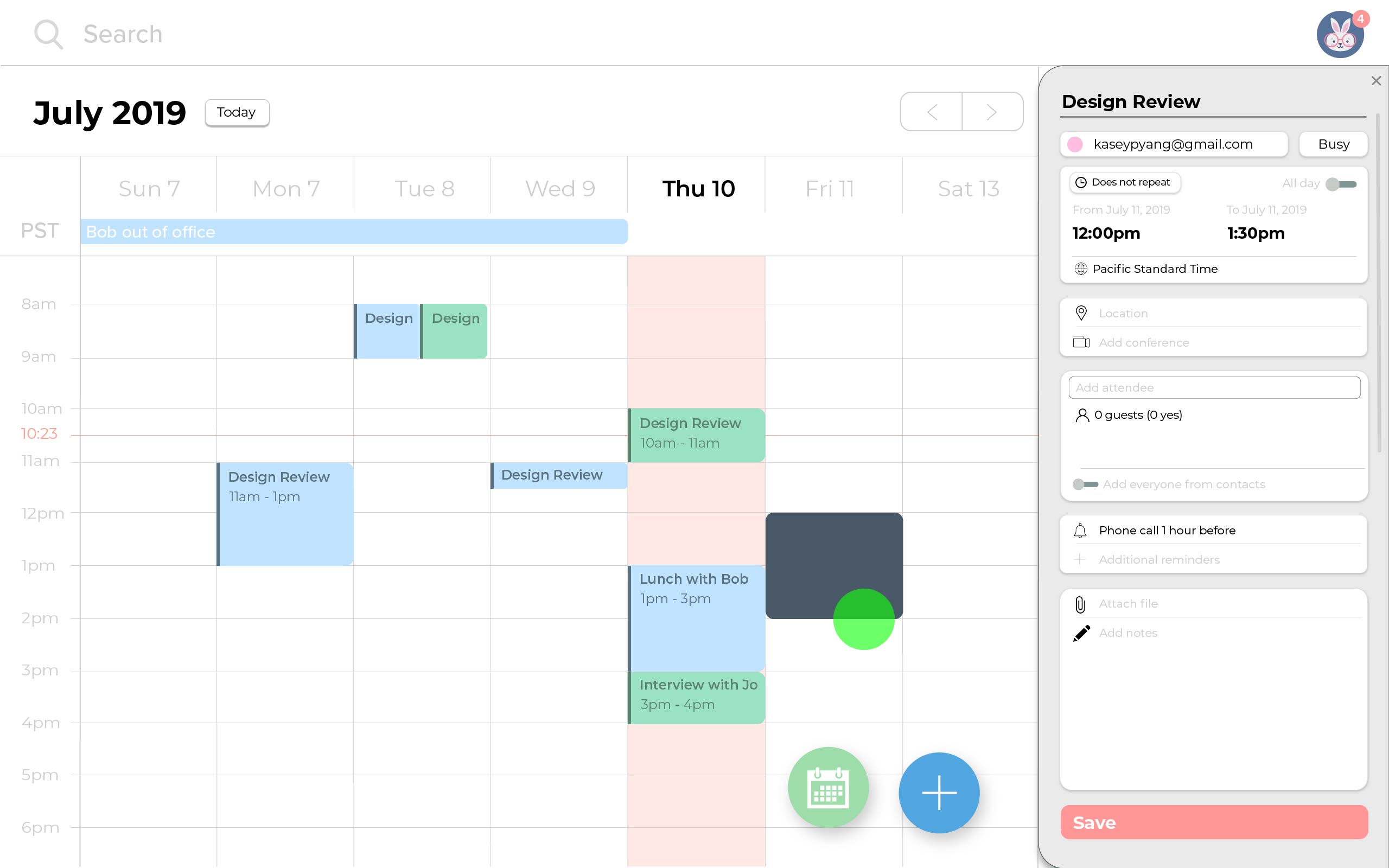
To address the issue of users not being able to see the create event modal, I thought it would be useful to turn it into a pop-up, and the same for event details. However, there was an issue that arose because the founders wanted the calendar to be as easy to navigate as possible, and that meant the entire weekly calendar to be visible when creating events so the user could know their schedule ahead of time. I had also moved the small calendar and events list to the left side so it would be the first thing the user sees.
Second Iteration
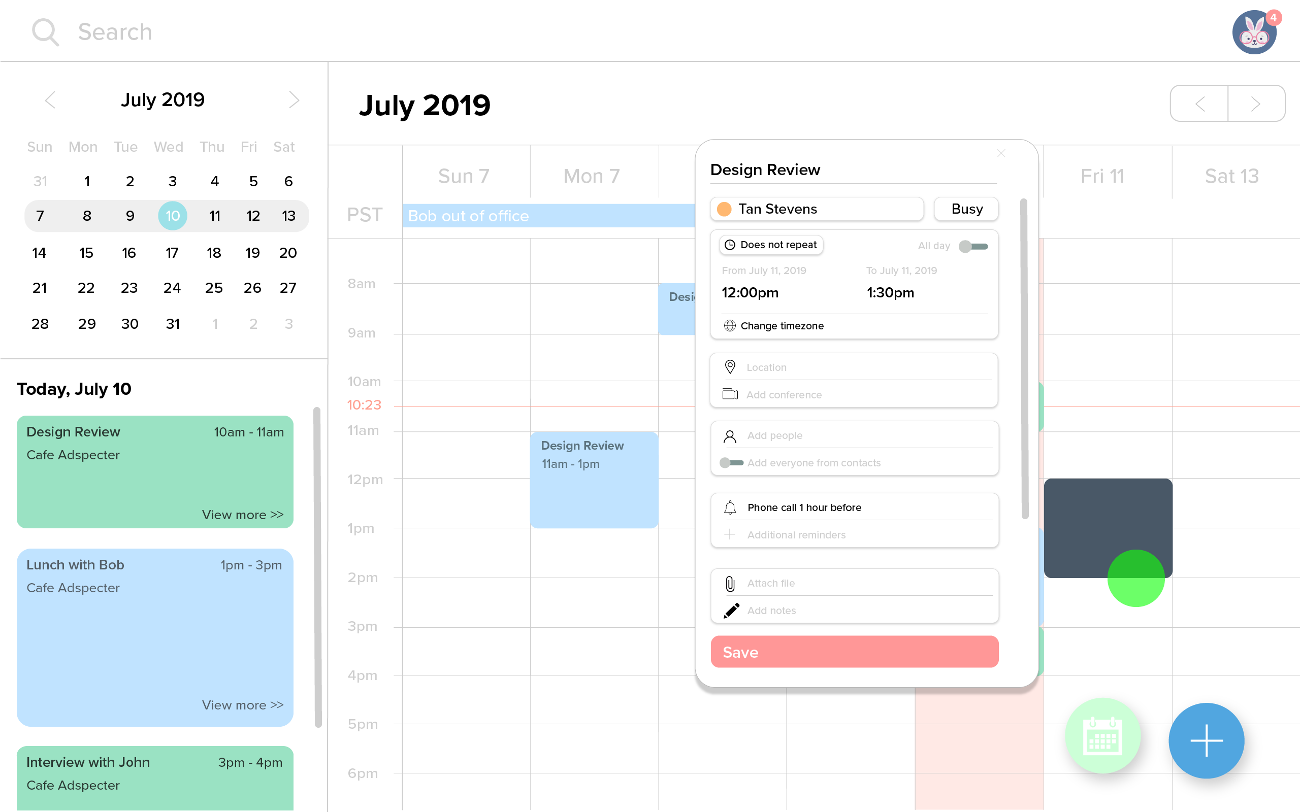
Taking into account the feedback from the first iteration, the second came with these results. The create event page would be a slide-out from the side, an animation drawing the user's eyes to the new environment. However, the problem with this is that the side bar became extremely busy and over-crowded.
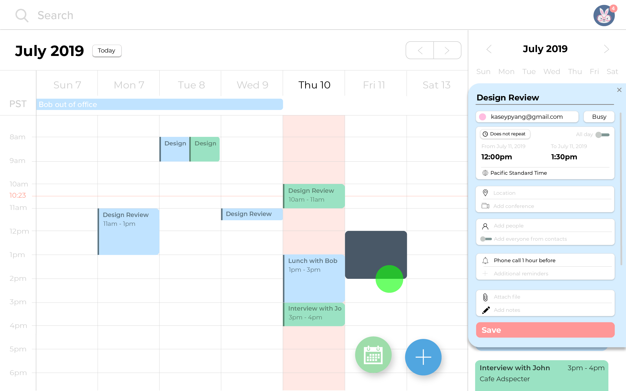
In the first iteration, I had used rounded corners on all edges of each event. However, an issue arose when multiple events were occurring on the same day at the same time: it became difficult to see and discern between events, especially when they were the same color. Rounded edges look much more modern and easier on the eyes than just squares, so a compromise was having the event shape half rounded rectangle, half normal. This way a small, darker sidebar could appear on the left without it looking too awkward.
I also changed the font in the second iteration to Montserrat, where it was originally Raleway and then PRoxima Nova in the first iteration. The reason I chose Montserrat is because it felt more fresh and geometric than Proxima Nova, and Raleway was hard to read in large chunks of text, while Montserrat is more spaced out.
Third Iteration
Taking into account the feedback from the first iteration, the second came with these results. The create event page would be a slide-out from the side, an animation drawing the user's eyes to the new environment. However, the problem with this is that the side bar became extremely busy and over-crowded.
Branding
One of the founders' wants was having a cohesive theme throughout the site. There are a few branding aspects considered when going through all of the iterations.
Typeface selection: Montserrat
Montserrat is a relatively common font used for minimalism and simplicity. It’s available on Google fonts. I like this font because while San Francisco and Proxima Nova for example can look extremely similar, Montserrat stands out just a little bit. The font is modern with old school influences, as seen in its width and curves in certain letters. This font also has around 12 different weights and variations in its regular form, which is great for creating a visual hierarchy yet remaining consistent with brand on a website.
Color usage: blue and green for action items in the lower right hand corner
Throughout the mockups, I used green and blue for calendar colors, but in the actual version that would be up to the user. In the lower right hand corner of the screen, there are two action buttons: select availability, and add an event. Green as a color signifies safety and stability, so I thought it would be best for the selecting availability button. Blue is a color associated with expertise and action (highly used in corporate America), so it would be fitting as a color signifying adding more events to your calendar.
Calendar events: shape
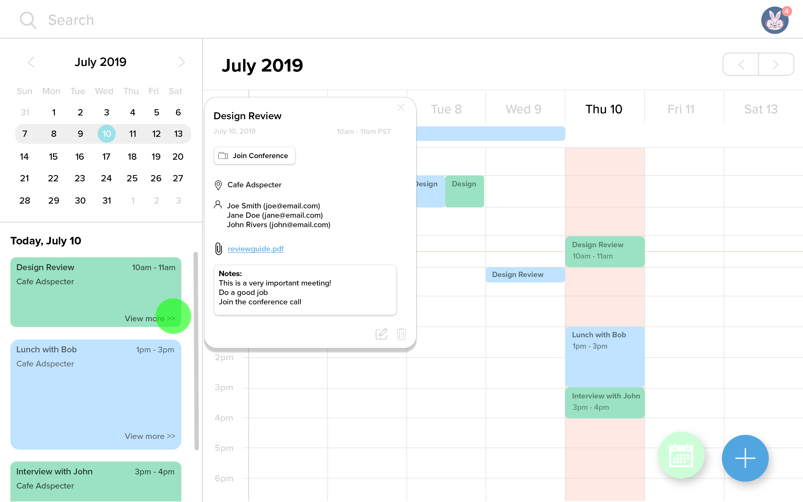
Rounded corners are much easier on the eyes for a user than sharp edges. A rectangle with four straight edges brings the attention to the shape and what surrounds it while a rounded rectangle brings attention to the information that is inside of it. There is actually quite a bit of user research on this! However, because this is a calendar, there is likelihood of there being more than one event at the same time on the same day. For this reason, in my design, the events are rounded on one side with a sidebar and 90 degree angles on the other. I think that this makes the information easy to process and nice to look at while also making it easy to sort through different events and keep track of everything that is happening at once. This is the same reason why they are rounded rectangles in the sidebar of the daily list.
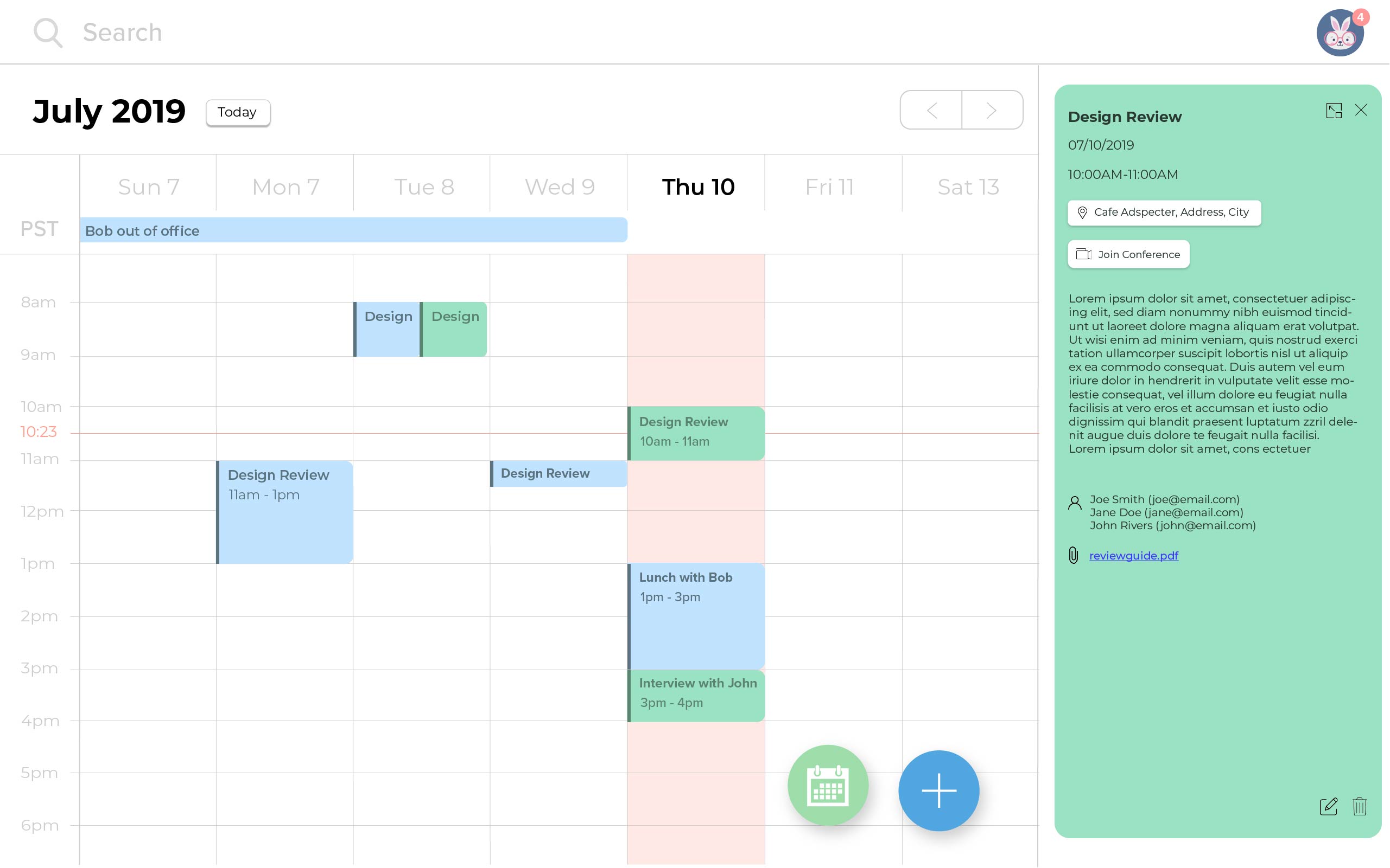
Event details: button usage
For the event details, there are three buttons that lead to external links: the location, joining the conference, and any attachment that a user has added. However, only the location and joining the conference are highlighted as buttons, while the attachment is stylized as a link would be on a browser. This is because I believe that the location and joining the conference are the two most important items that a user would need to see as quickly as possible. However, the attachment is not quite as pressing because it likely would not need to be accessed until during the call or will be reviewed before the call, so it falls lower in terms of hierarchy of importance of buttons.
Reflection & Next Steps
I learned so much about the design process during this project. It was my first ever client project, and I was careful to put a lot of thought into each decision I made. With real stakeholders to keep in mind and to focus on accessibility, I felt that I was finally able to put all the concepts that I learned in the classroom into a real-world situation. It was a pretty open-ended project, the founders had approached me saying that they didn't necessarily have a strict direction that they wanted to go towards. This helped me expand my creative horizon and utilize more resources, color schemes, and typographic choices.
This project is still not complete, so the next steps are to continue following up with the founders to make sure that their needs are being met, and to offer assistance if any new issues come up.